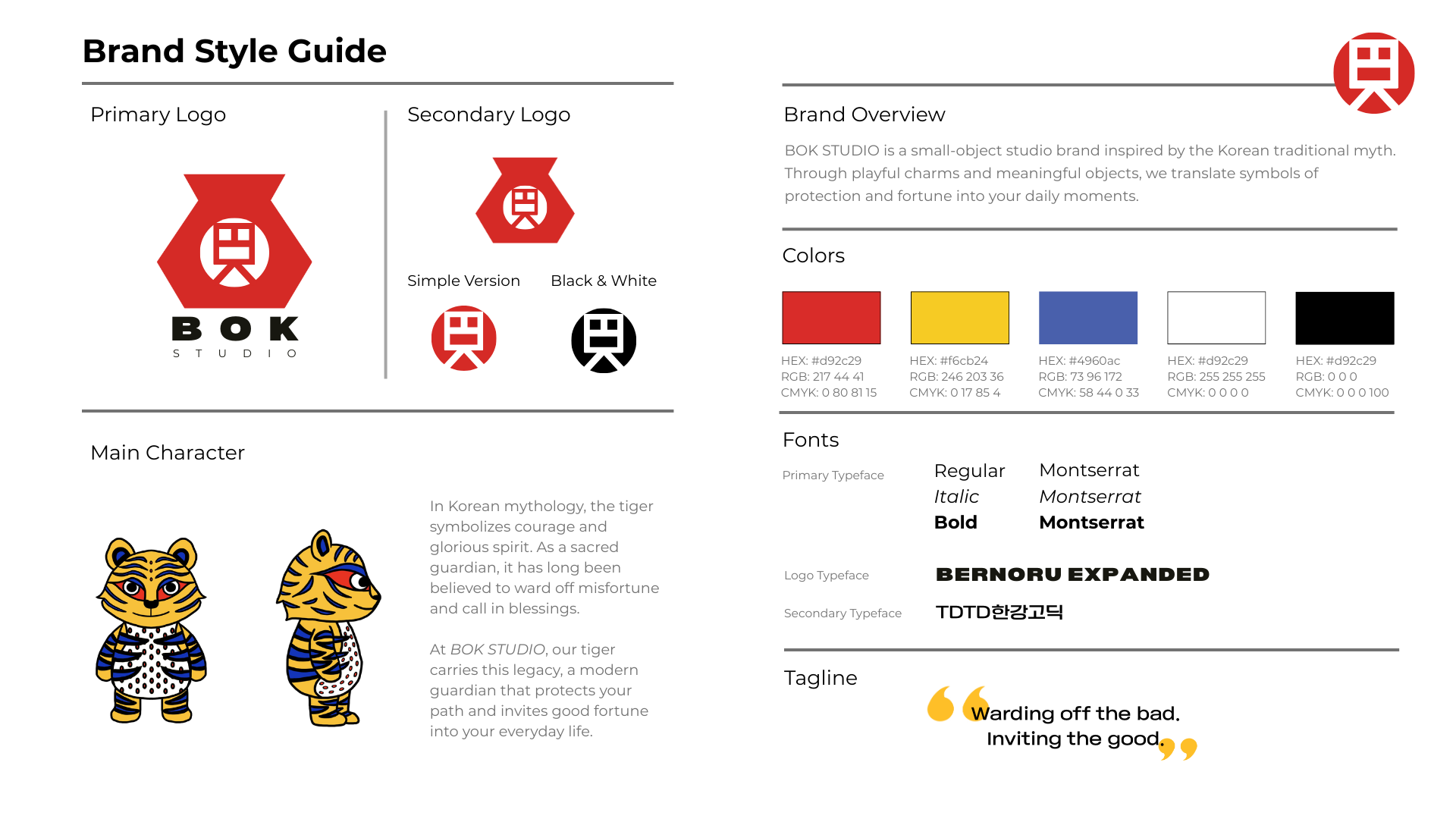
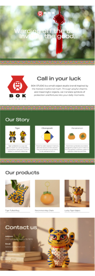
BOK STUDIO Branding
BOK STUDIO: Cultural Storytelling Through Small Objects
BOK STUDIO is a narrative-driven brand that reinterprets Korean cultural symbolism into modern “small objects,” transforming everyday items into meaningful experiences. The project explores how design can carry emotional and cultural value beyond aesthetics, allowing objects to feel personal, symbolic, and intentional.
ABOUT THIS PROJECT
This project began as an exploration of how traditional cultural elements can exist in a modern, everyday context. Growing up between cultures, I’ve always been interested in how identity is expressed through visuals and cultural background. With BOK STUDIO, I wanted to create a brand that makes cultural storytelling feel more accessible and familiar.
Rather than designing standalone products, I approached this as building a cohesive brand system where each object carries a narrative from symbolism, luck, and emotional meaning.
CONCEPT
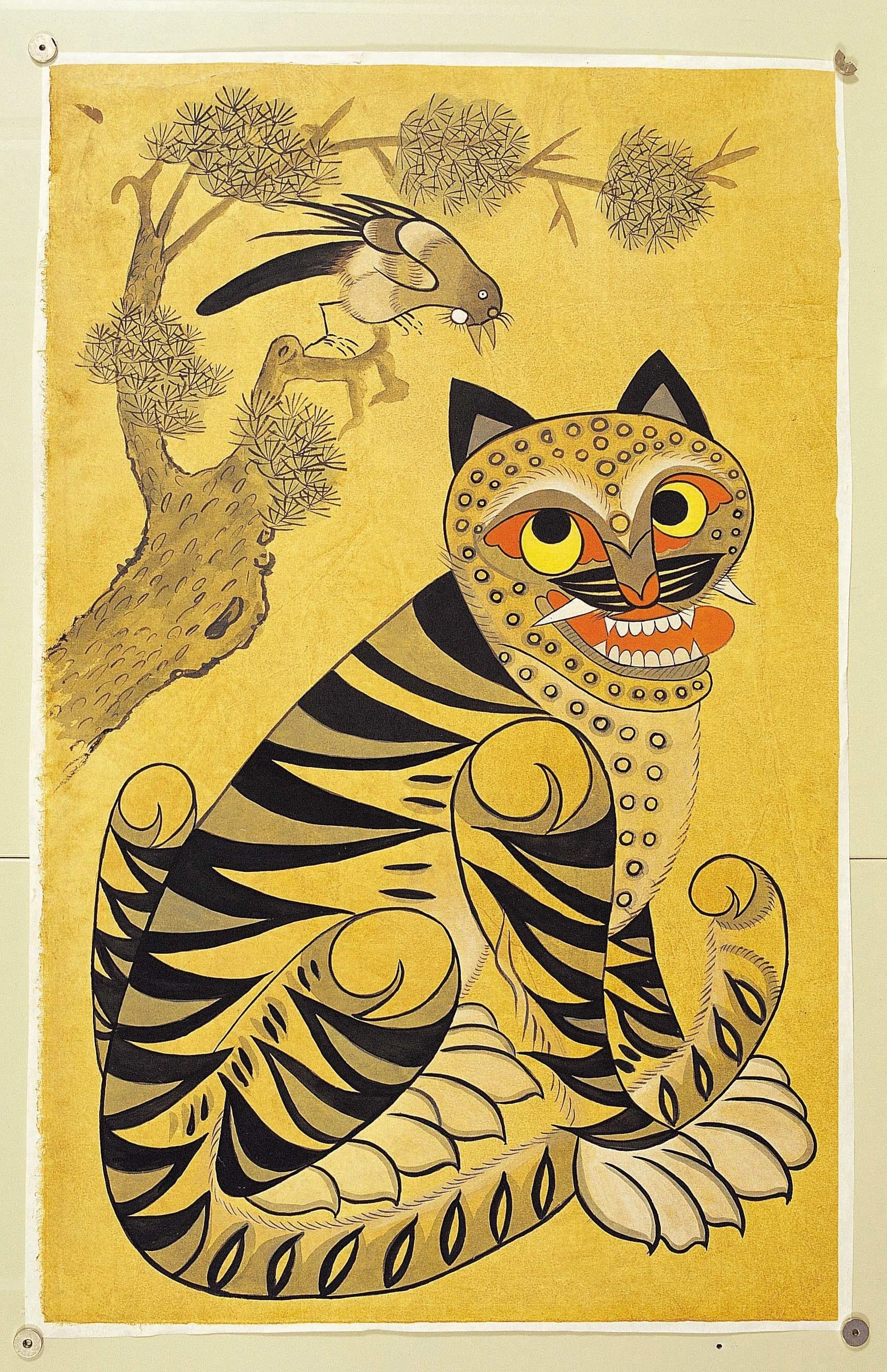
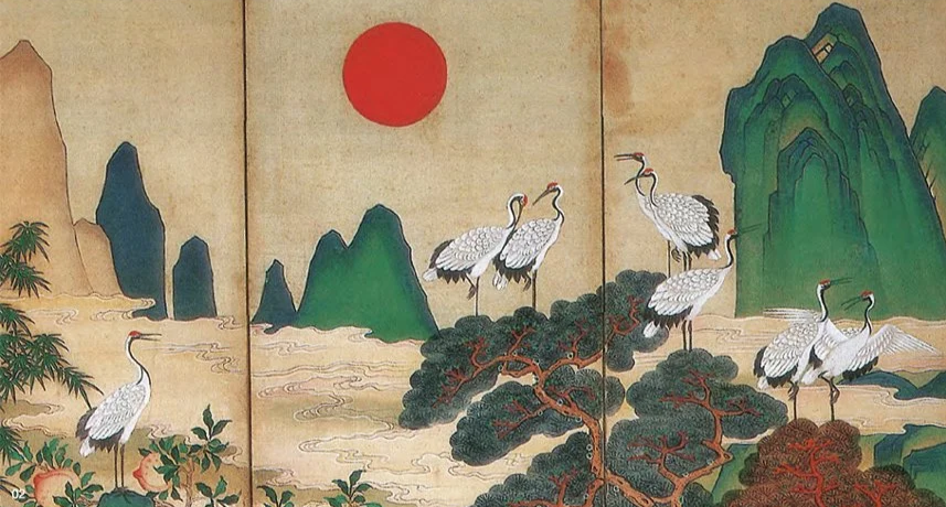
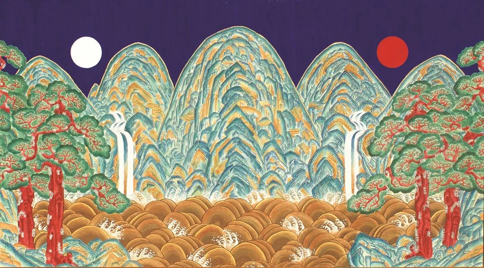
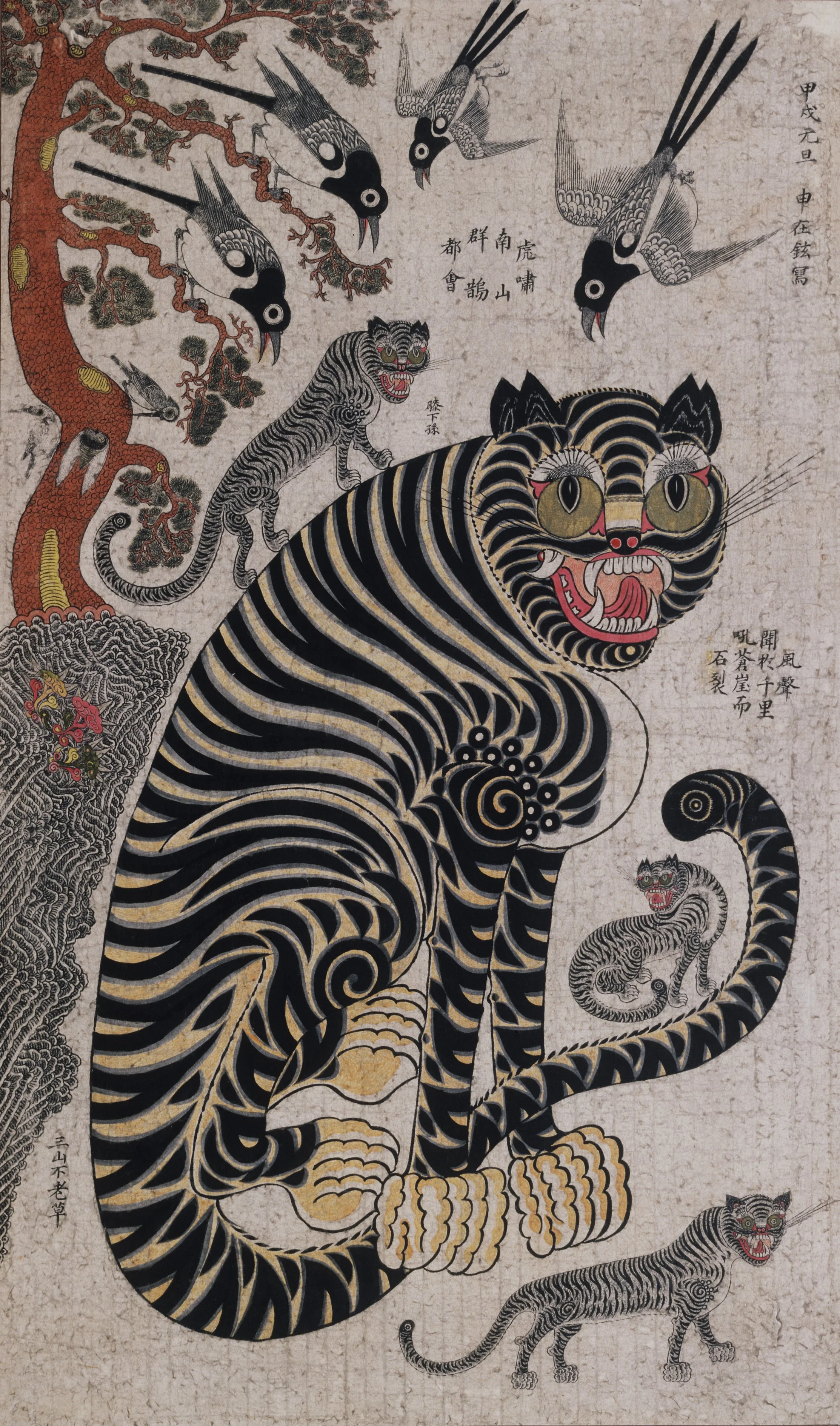
I noticed that Korean traditional folk paintings, especially those featuring tigers (호랑이) and dried persimmons (곶감), carry strong symbolic meanings representing protection, fortune, and warmth in people’s everyday life.
I was also inspired by how contemporary media like K-pop demon hunters successfully reinterprets traditional Korean motifs into something that feels a unique, stylized, and globally accessible story. It does not replicate tradition exactly, but instead reconstructs it in a way that resonates with a broader audience.
This made me question how design can function as a bridge between cultural symbolism and modern branding. I wanted to translate these symbolic elements into a contemporary visual identity that preserves their cultural meaning while recreating them within modern products and everyday experiences.
DESIGN PROCESS
I. EXPLORATION
II. DEVELOPMENT
I developed BOK STUDIO as a multi-layered brand system, where each component plays a specific role to express the concept.
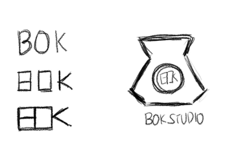
1. LOGO DESIGN
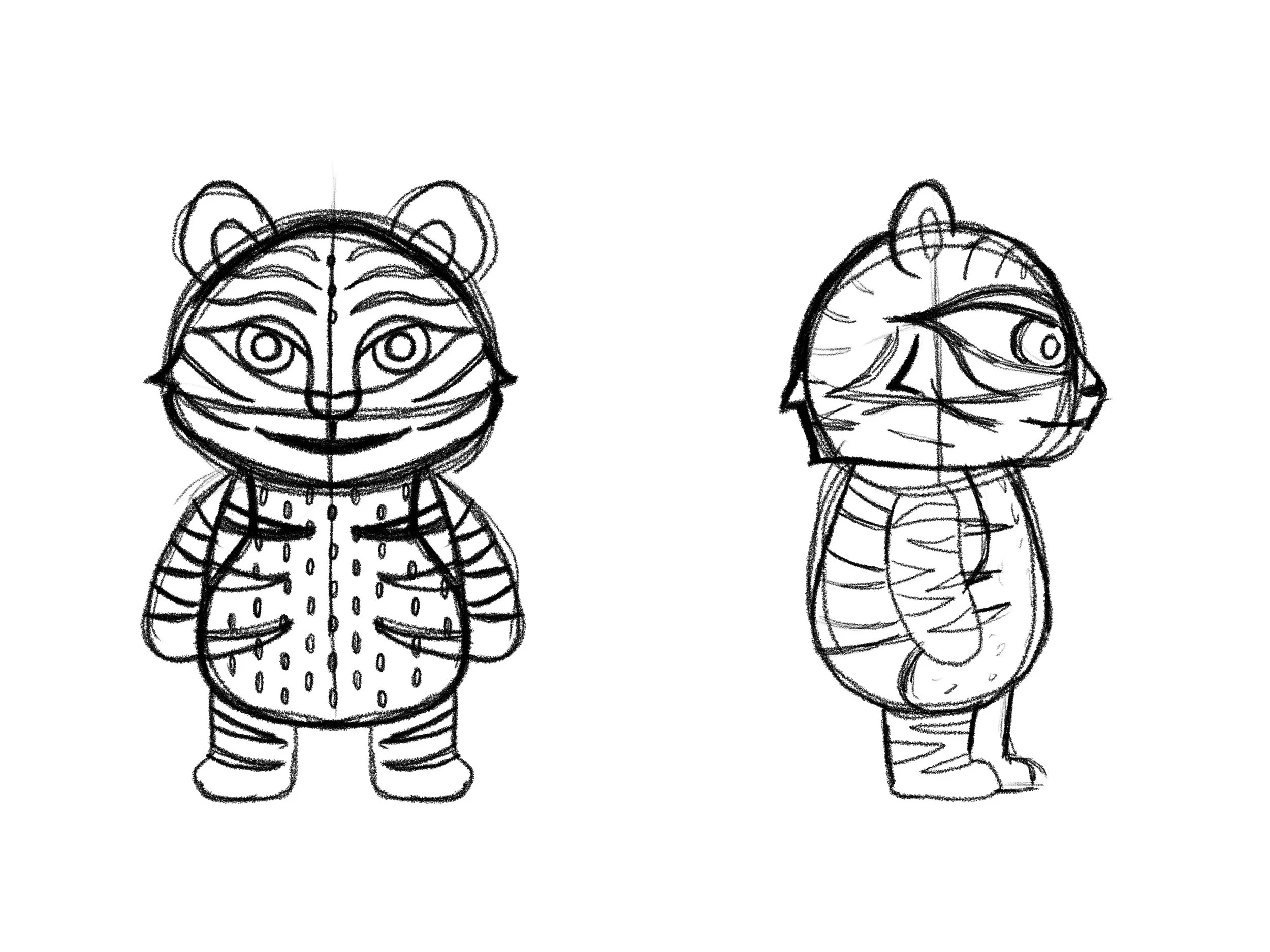
2. CHARACTER DESIGN
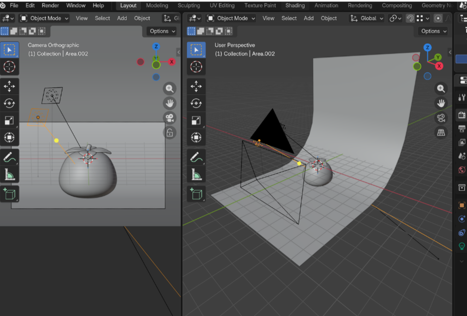
3. 3D ASSET DESIGN


BEFORE
AFTER
REFLECTION
MY ROLES
Brand Designer / Creative Strategist
TOOLS
Blender, Photoshop, Procreate, Figma
SKILLS
Branding, Cultural research, Product Design, Concept Development, Storytelling, UX Design, Digital Prototype, 3D modeling
LINKS
I started by researching Korean traditional folk paintings, its patterns, colors, and symbolic elements. I was especially interested in how these elements represent their inner meaning of protection, luck, and prosperity.
From here, I created a mood board that combined:
Traditional Korean visual language (repetitive patterns, symbolic animals)
Strong, visual color palettes to balance tradition and contemporary design
Meaning behind each character, colors, and symbol
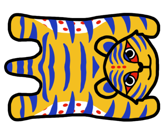
Character designs specially around tiger


The logo was inspired by the traditional bokjumeoni (lucky pouch), which represents fortune and blessings.
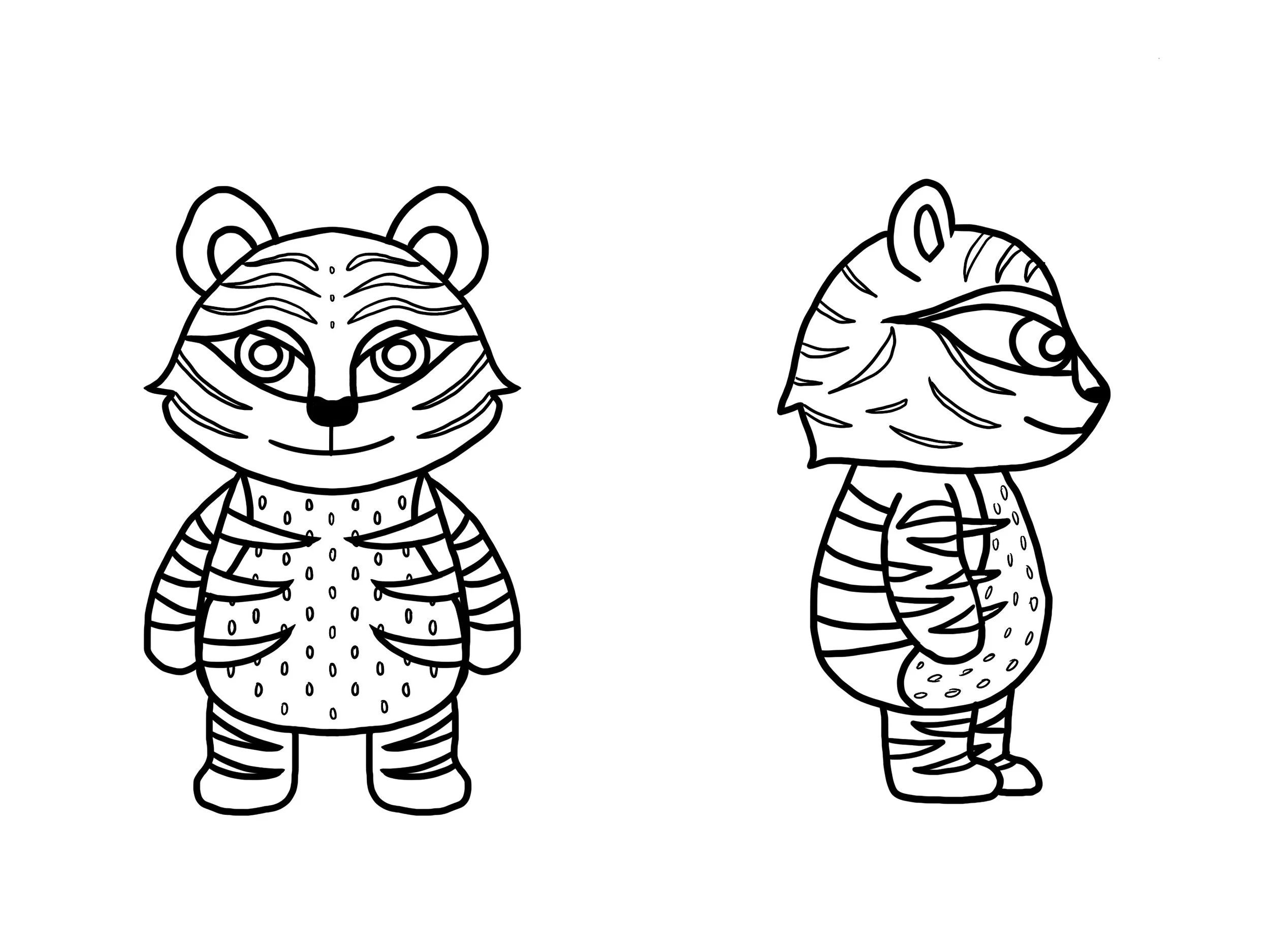
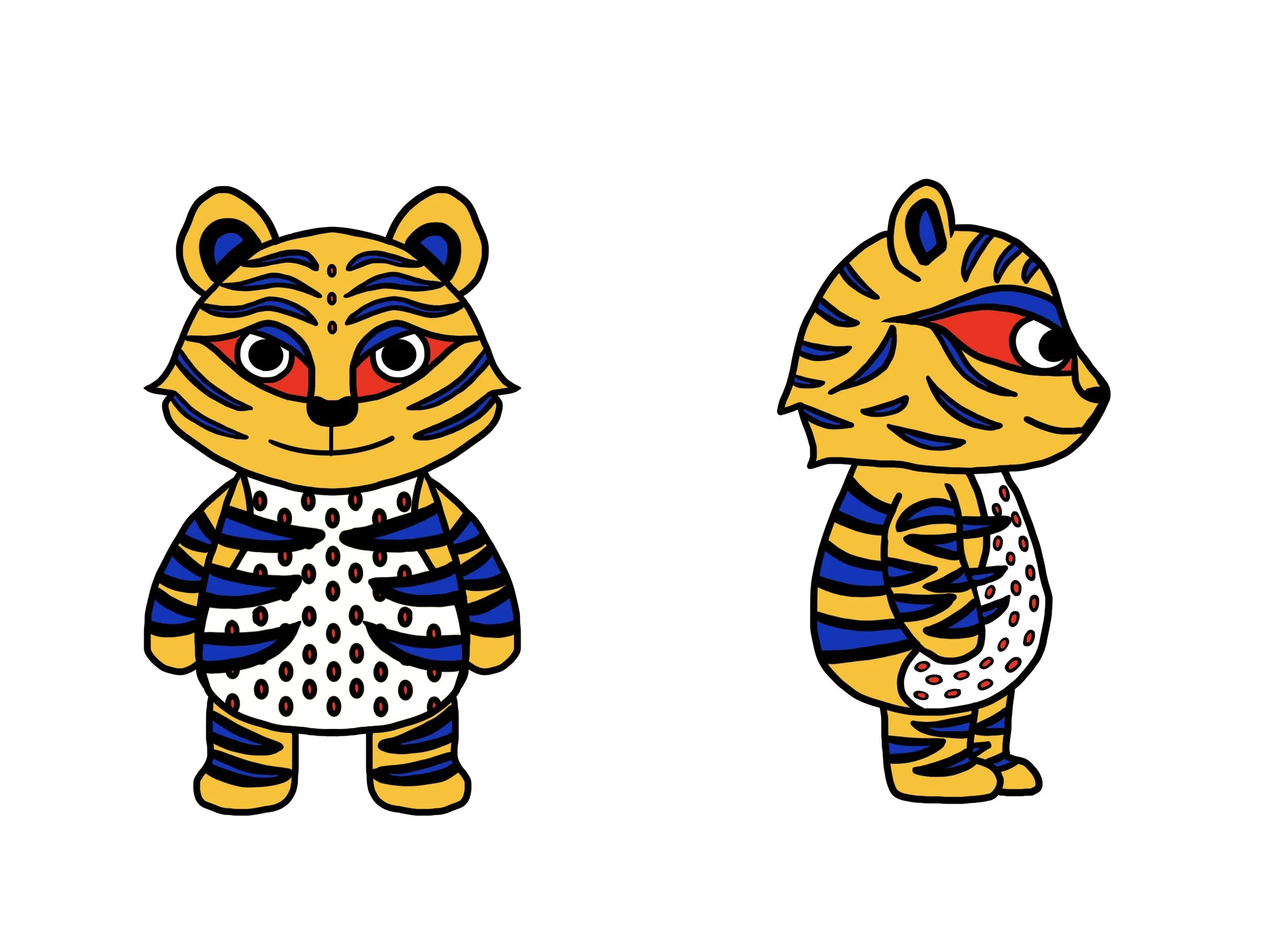
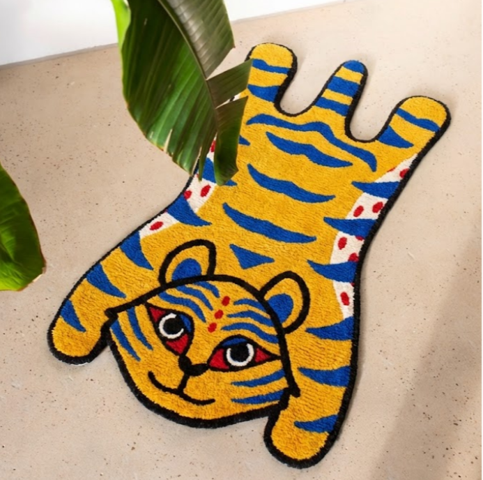
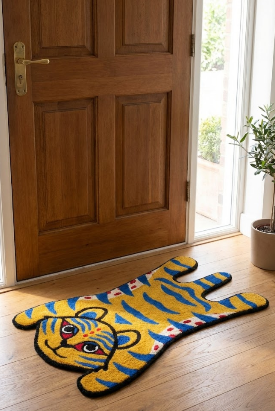
The tiger was developed as a core brand character, inspired by traditional folktale but simplified into a more approachable form based on brand color palette.
4. PRODUCT GRAPHIC DESIGN
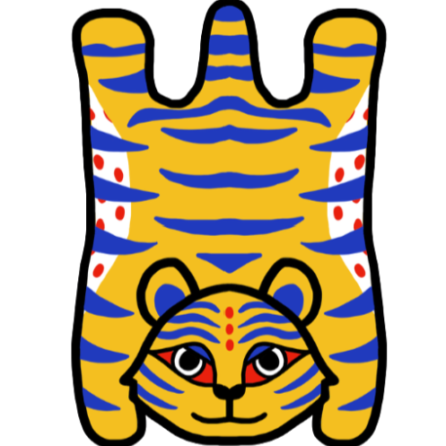
The tiger motif was extended into a textile-based graphic application.
The gotgam (dried persimmon) was developed as a 3D object using Blender, representing warmth, comfort, and abundance.
III. EXECUTION
AI-Generated Images
To combine all elements, I developed a brand guideline that defines: brand message, cultural narrative, visual language, color system, typeface, tagline, and tone.
The initial version of this project was presented as a sequential mockup created in Canva. While it still visually showed the flow of the brand website, it functioned more like a static slides rather than an interactive experience with users.
Linear, slide-based structure
No user interaction or navigation
Focused on final visuals than process
Limited storytelling depth and user engagement
Based on users’ feedback on interactivity, I redesigned the project as a functional website prototype using Figma, transforming it into an interactive and immersive brand experience.
Built a fully clickable interface with working buttons and interaction
Introduced user flow to simulate real interaction with the brand
Expanded storytelling through structured sections (concept, process, outcome)
Integrated process documentation to show decision-making, not just results
One of the most successful aspects of this project was bringing five different projects together into a cohesive brand system. By connecting character, product, and identity based on my cultural background, the project became more engaging and structured. Giving individual narratives to each item was especially insightful, specially from a business perspective, where storytelling often becomes the strongest initiative for how a brand or product connects with its audience.
A challenge I faced was balancing cultural authenticity with modern design. Simplifying traditional elements without losing their original meaning required careful decision-making and continuous research.
Through this process, I gained a deeper understanding of how cultural identity can be translated into a brand. I realized that branding is not defined by visuals alone, but by the narrative that gives those visuals meaning and direction. If I were to continue developing this project, I would expand it into more interactive formats, allowing users to engage with cultural storytelling in a more immersive and participatory way.